Martin Parr
http://www.martinparr.com
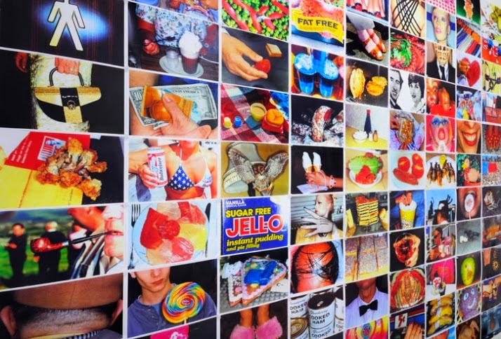
This photographer focuses on colour photography, he shows colour through a variety of different things. When looking a some of his work I found that he likes to show colour through events that have taken place. He also shows colour through food photography.
Looking at the photograph above you can see that it is one big multiple imagery piece of Martin Parr's work. You can see the contrast between all the different colours and see the variety of his work.
Corrie White
http://www.photoventure.com/2013/05/17/20-amazing-macro-photographers-on-500px/
Corrie White is a liquid art photographer who uses coloured liquid to make it look like its dancing. She uses vibrant colours against black backgrounds. she captures movement & splashes within her work by focusing on close up photography.
When looking at the photograph above you can see that the use of vibrant colours have been incorporated & this continues throughout Corrie's work.
Suren Manvelyan
http://www.surenmanvelyan.com
Suren Manvelyan focuses on eye photography, both human & animals. He photographs eyes as he is a macro photographer & likes to show people the detail of the eyes that you wouldn't see in everyday life. Due to the photographs being so close up you can see the patterns on the eye.
As you can see from the image above the photograph shows a sky blue colour contrasting with the black pupil, although this photographer doesn't specialise in documenting colour photography I found that he expressed the use of colour through his work very well.
Randovan Rinaldi
http://www.photoventure.com/2013/05/17/20-amazing-macro-photographers-on-500px/
 Randovan focuses on flower photography but also contrast photography as he tends to photograph vibrant coloured flowers against a black background. Due to the fact that the photographer uses black background it highlights the vibrant colours within his work, for example the vibrant red in the photograph above.
When looking at the photograph above you can see the clear contrast in the photograph. You can also see that the flower has water droplets on it which create a 3D effect to the image & makes you imagine the texture of the flower.
Randovan focuses on flower photography but also contrast photography as he tends to photograph vibrant coloured flowers against a black background. Due to the fact that the photographer uses black background it highlights the vibrant colours within his work, for example the vibrant red in the photograph above.
When looking at the photograph above you can see the clear contrast in the photograph. You can also see that the flower has water droplets on it which create a 3D effect to the image & makes you imagine the texture of the flower.
Ernst Haas
Ernest Haas is a colour photographer. His work shows a very wide range of different elements, from abstract photography to flower photography. He as one of the most celebrated and influential colour photographers of the 20th century.
As you can see from the photograph above the colour red is shown through the use of red tulips. The photograph is a close up image which allows you to see the patterns/water droplets sitting on the petals. You can see the contrast between the vibrant red and the black background.
Alexander Khokhlov
Alexander Khokhlov is a fashion photographer that incorporates colour into his work through variety of different and interesting ways. For example he paints models faces in very unique ways. He also incorporates colour through the use of contrast.
As you can see in the photograph above the uses the vibrant red colour scheme through the image but everything else is very grey and dull, almost like the selective colour effect. The photograph is a portrait image but it includes a lot of the background to show the contrast feeling to a deeper level as it makes the red areas seem more significant.
Michael Bosanko
Michael Bosanko is a light graffiti photographer. He uses lights and a slow shutter speed to draw graffiti & pictures with lights and then they appear in his images. The drawings are a way of incorporating colour into his work. His work is very visually pleasing to look at.
As you can see from the photograph above, the idea is very creative & imaginative. There is a clear contrast between the bright, vibrant lights and the darker, shaded background.
Mark Mawson
Mark Mawson is a liquid art photographer who shows colour through liquid diffusion. His work is extremely interesting, colourful & unique. He tends to use plain white background to highlight the bright colours of liquid being dropped into the water.
As you can see from the photograph above the photo is very surreal & it makes you question how he captures such a fast movement. The photograph is a close up image which allows you to see the image to a greater detail. You can also see the different coloured liquid starting to mix, going from blue, green & then to yellow at the ends.
Nancy Alford
http://www.contrastphotographyuk.com/prints/landscapes/index.htm
Nancy Alford is a landscape, contrast photographer. She uses landscapes to show contrast within her photography. Her work is very colourful and she uses a different range of colours, some bright and vibrant, the others pastel and neutral.
As you can see from the photograph above the image has been taken from a low angle and the walk way seems to go on forever. The pastel colours within the image contrast each other. The lighting used is soft to create the same light all around and no darker areas.
Angela de Bona
http://www.angeladebona.com
Angela De Bona is a fashion photographer who shows colour through make-up, clothing, accessories ect. Vibrant colours are hugely expressed in her work as fashion photography is all about colour and creating a big impact.
As you can see from the picture above the colour is very important and the makeup/hair is very exaggerated. A plain grey background has been used to highlight the bright, vibrant colours of the models make-up & hair.
Dez Santana
http://www.dezsantana.com/graffiti
Dez Santana is a graffiti street photographer and artist, he paints most of the graffiti himself & then photographs is with his signature on the top to make it unique to him which is very important when photographing graffiti. He uses the graffiti to show bold colours within his work but also to show contrast between the graffitied surfaces and the normal plain surfaces.
As you can see from the photograph above colour is very important in Dez's work as graffiti is all about colour & patterns. The photograph has a very urban feeling to it but its also very natural with the sun light creating shadows on the floor. The photograph has been taken from a slightly low angle.
Steve Payne
http://www.stevepaynephotography.co.uk
Steve Payne is a food photographer that uses the food itself to incorporate colour into his work. He uses still photography but he also captures motion in his photography also with water photography to make his work more interesting to look at.
As you can see from the photograph above he has captured the movement of a champaign bottle popping open, this makes the photograph more appealing. Theres a contrast between the green bottle and the cherry red background.
Cristina Otero
https://www.flickr.com/photos/cristinaoterophoto/
Cristina Otero is also a food photographer, however she uses people & portraits to show her food in a very different way. She also uses vibrant, exaggerated make-up to introduce colour into her work. She has very different work to other food photographers.
As you can see from the photograph above the make-up matches the fruit itself and the colour scheme is the same. The image is a close up portrait of the model and the facial expressions of the models within Cristina's work are very important as they make the photographs more appealing.
Viktoria Stutz
http://www.viktoriastutz.com/portfolio/
Viktoria Stutz is a beauty/make-up photographer, she uses make-up and accessories to incorporate colour into her work. Some of her work is very simple and other pieces are very exaggerated and extreme. She uses bold, vibrant colours throughout her work.
As you can see from the photograph above I have chosen one of the simple images which a small amount of make-up, the only colour in the image is the eyes and the lipstick running,however I like that the small area of colour has a significant effect on the photograph and its more interesting to look at.
Sarah Cheng-De Winne
http://www.sarahcheng-dewinne.com
Sarah Cheng-De Winnie is a fashion photographer that shows colour throughout eh use of clothing & make-up. She also uses different cultures to show colour. Portraits tend to be her main focus.
As you can see from the photograph above the colour red is used to incorporate colour and show contrast against the models pale skin. The models reflection can be seen in the background. The composition of this image includes the model being positioned on the left hand side.
Kalle Gustafsson
http://www.kallegustafsson.com
Kalle Gustafsson is a commercial photographer, she uses clothing, landscapes and products to incorporate colour into her work. There is a huge variety within this photographer work and people are very important within her work.
As you can see from the photograph above colour has been introduced through the womens red dress. Scale is very important in this photograph as the male model seems to be as tall as the building and the women is very small, this could be supporting stereotypes as stereotypically men are more powerful than women.
Nicholas Samaras
http://www.underwater-photography.gr/#/photo-sets/Sea-Slugs/109/
Nicholas Samaras is an underwater photograph we. He uses animals and people to photograph. he incorporates colour into his work through the vibrant underwater plants and the fish as they have bright colour patterns on them. He takes pictures underwater during nighttime to create the black background effect.
As you can see from the photograph above it has been taken during the night which is why it has the black background look. The vibrant purple underwater plant stands out more against the black sea and contrasts with the orange parts in the flower itself.
Blair Bunting
http://www.blairbunting.com/people
Blair Bunting is a sports photographer. He uses clothing and motion to show colour within his work. His work is very interesting to look at as he captures movements as well as still images.
As you can see from the photograph above colour has been shown through the sportsman's clothing. There is a contrast between the red and the darker black areas of the photograph.
Davina & Daniel- International Wedding Photography
http://davinaplusdaniel.com
Davina & Daniel are international wedding photographers who incorporate colour through clothing and events(weddings). All of their photographs have a happy, fun feeling behind them as it is a wedding day when everyone is happy. Capturing natural, un expected photos are also included.
As you can see from the photograph above colour is incorporated through background lights and clothing. The spraying of a bottle has been captured in motion and you can see from peoples facial expressions that they are having fun.
Krzysztof Browko
http://browko-photography.pl
Krzysztof Browko is a landscape photographer than incorporates colour through the landscapes themselves. For example: sun sets, beaches ect. The colours in this photographers work are very natural as they are landscapes.
As you can see from the picture above the sun set is the key element of colour. The sun set its contrasting with the blue sea and also being reflected. The photograph above was taken in Greece. Krzystof take landscapes of all over the world.