Documenting In Colour
 In this photograph colour has been shown through the technique selective colour. the background has been edited black and white but a certain part of the image has been selected and kept in colour. This makes the colour stand out and shows a contrast between the black and white area and the coloured area. The use of selective colour could also indicate important places, for example: in this image the coloured area is the underground sign which is an important sign.
 This photograph is from Ernst Haas work. The use of colour has been shown through vibrant red petals against a plain, black background. This shows clear contrast. The petals have water droplets on them to give the photograph texture. The lighting is soft and is shown to light the flower itself rather than the background.
 In this photograph colour has been shown through the use of lights & movement of a merry go round. The photograph has been taken at night time to highlight the lights on the merry go round as they stand out against the black sky but also the lights tend to been more vibrant and visible at night. This photograph fits well into the category of Documenting in Colour as it is an event that has taken place and colour is being expressed through the photograph.
 This photograph shows colour through the use of graffiti. Big, bold, colourful letters have been used to make the image eye catching and different from normal writing. This photograph has a very urban feel to it as its street photograph, taken on location. There is contrast shown in the photograph between the brighter colours such as yellow and the darker colours such as black and dark blue. A black outline around the letters has been used to create a 3D effect.
 In this image colour has been expressed through the use of glow in the dark pain. Dark lighting has been used in order for the paint to glow but also a glow in the dark background has been used to slightly light the model herself so you are able to see her rather than just being able to see the paint glowing. The glow in the dark paint has been mainly used on the models features, for example: eyes, mouth and ears. There is a clear contrast between the glow in the dark vibrant orange and the dark areas of the models skin.
 This photograph shows colour through the use of make-up. Soft natural lighting has been used to highlight the smooth texture of the skin. The colour pink seems to be the colour scheme of this photograph. All the make up coordinates together as the model has pink lips and pink eye shadow. The eyes seem to be the main focus of the image as large eye lashes have been used to make them more exaggerated and bold, two vibrant colours have been used as the eye shadow to make the eyes more eye catching. A neutral background has been used to match the colour of the models skin.
 This photograph shows colour through the use of animal feathers. There is a flow of colours through this image as the red fades into yellow and then into blue as you can see from the back of the birds feathers. The background has been blurred and the subject(the bird) is in focus as its the closest object to the camera & the main focus of the photograph. Natural lighting has been used as it's a location photograph.
 In this image the use of colour has been shown through glow in the dark paint in glass bottles. This gives the allusion that the bottles are glowing and are different colours. A black background has been used to highlight the vibrant colours as it makes them stand out more.
 This photograph shows the use of colour through making the lips rainbow. Selective colour has been used and the lips themselves are the only part of the photograph that is in colour and the rest is black & white. The image is a close up image which allows the lips to be the main focus of the image.
 In this photograph paint has been used to express colour. The paint is is dripping down the models face which indicates movement. the lighting used is lighting up the centre of the models face and creates shadows on the edge of the models face as the areas are darker than the centre. The background used in this photograph has been co-ordinated to match the models eye shadow as they are both he same shade of green.
 This image shows colour through pastel coloured balloons against a black and white background, this is known as selective colour. By having the model holding balloons and having the background image including a number of building tops, it gives the allusion that she is floating in the air.
 In this photograph the use of colour has been shown through funfair rides and movements. The photograph has been taken from a low angle but seems to be the normal prospective as you would be looking up at the funfair rides in feel life. The bright blue sky and the sun shinning on the big wheel highlights the vibrant colours within the photograph has it makes them look a lot more appealing and bright.
 This photograph shows the use of colour through exaggerated make-up. The colours used in the photograph are very dull and then splashes of vibrant colours are included, for example bright red and yellow circles around the eyes. The lighting used is very shadowy as it creates many dark areas on the models face.
 In this photograph the use of colour has been shown through moving car/bus lights as the sped of the subject is so much faster than the speed your camera takes the picture it leaves behind a blurring effect. As the image has been taken at night the lights are making the colours more vibrant. The darker black edging around the photo highlights the purple colour running through the photograph.
 This image shows the use of colour trough a multi coloured building. Apart from the building in this photograph there is very little colour shown therefore it shows a contrast between the dull white & grey side of the picture and then the other rainbow side of the photograph. As the picture is taken on location natural lighting has been used.
 This photograph shows the use of colour through liquid photography. Liquid has been dropped in to water and captured at a very high speed. The image has then been turned upside down in order to make it look like the movement is going upwards rather than floating down in the water. A black background has been used as it allows you to see all of the different colours used as they stand out more individually.
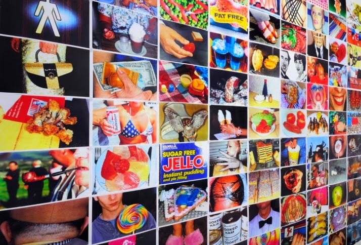 In this photograph the use of colour has been shown through a number of different things, for example: sweet wrappers, peoples skin colour, clothing, food ext. All of the different images have then been put together as one massive multiple imagery piece to show a variety of colour. This photograph was taken and made by Martin Parr.
 This image shows colour through the use of different colour paint. Patterns & shapes have been created on the models face. Rather bright lighting has been used to lighten the models face rather than the background as the models face is very bright and then the background is very dull. The models skin is very pale which makes the colour paint stand out more.
 In this photograph colour has been shown through selective colour as the background is black & white and then the two telephone boxes are red. Due to the fact that red is a vibrant, bold colour the technique of selective colour works well as it shows clear contrast.
 This photograph shows colour through fruit. A kiwi has been cut in half as the centre is a very vibrant green. The lighting in this photograph is very natural and a white background has been used. By having the kiwi cut in half it allows you to see the patterns that are in the centre of the kiwi. There is a contrast between the green inside and the brown outside.
 In this image the use of colour is shown through a sun set. The colours in this image all blend together as the dark blue at sky at the top of the photograph blends to pink, purple and orange. This photograph shows peace as the water is very still and calm.
 In this photograph colour has been shown through contrast. A number of green ables have been placed in the background and then one large red pepper is placed in the middle, this shows a clear contrast between the bright green and the bright red. The contrast in this image is a lot clearer than in other images as there are only two colours included in the photograph. I like the feel of this image as I like how everything is one colour and then there is just something small in a different colour as I like how it stands out.
 In this multiple imagery piece colour has been shown through the different seasons, Autumn, Spring, summer & winter. You can see that the colours vary depending on the season, for example in the bottom right hand picture the green colour of the leafs are very bright whereas they are becoming darker in the top left picture. In the winter photograph very little colour is used as its all dark & dull.
 This photograph shows colour through a beach setting. The different blues all fade from one to another and the colours seem to get lighter from the left side of the image, moving along to the rift side. The lighting is very bright and sunny as its a beach location.
 This photograph shows colour through the use of human eyes, selective colour has been used to highlight the blue eye. Due to the fact that the image is a close up image you can see a number of different colours within the eye, the pupil is black and then around that is a green/yellow colour which moves to blue. The photograph has been taken from a direct in front angle.
No comments:
Post a Comment