Tuesday, 28 April 2015

Photographer Five- Cristina Otero

Why Chosen: I have chosen this photograph as she uses vibrant colours within her work but in a very different & interesting way to the work that I have looked at before. I liked the way she links the colours to the food that is included in the photographs. I also like how she makes simple portraits look bold & interesting. I found that she also makes the models look like the fruit itself.


In this photograph above you can see that a lemon has been used to show colour within the photograph. The model has been painted to look like a lemon fruit. The yellow stands out against the models pale skin. The models facial expression also links to the use of the lemon as she has a sour face like when you ear a lemon. The composition of this photograph is very tight & only included the eyes & below of the models face as they eyes and lips are the key areas of the photograph. 


This photograph above shows colour through the fruit orange. The model herself has been made to look like an orange. There is a clear contrast shown between the bright orange & the navy blue of the models eyebrow & hair in the background. The model facial expression makes the photograph more existing as she looks existed. The lighting used is soft, high key lighting as it highlight the bold colours & doesn't create any shadows on the models face. 


In this photograph above colour is shown through the use of a passion fruit and make-up. The model has very pail skin but vibrant colours are introduced through the use of bright blue eye shadow and red lipstick. Soft lighting is used to create a natural look. The background of this photograph where the models hair is, is fairly blurred. The models eyes tend to draw the attention when looking at the image as the blue highlights her own blue eyes & makes them appear to be bigger.


This photograph above shows colour through the use of a water melon, the model herself is made to look like a water melon. The same red and green colour of the fruit itself is incorporated onto the model through make-up, red eye shadow is used but then the model has green eyes which links to the colour scheme of the water melon. The shape of the water melon & the position of if makes it look like the models smile. The lighting used is soft to create a natural feel to the photograph.

Influence: This photographer has influenced me to experiment with different ideas & ways of showing colour through photography. Therefore within this project I would like to do more experiments within my shoots as I feel it makes the photographs more interesting. This photographer has also influenced me to be bold with the use of colours.

Summary: Overall this photographers work has influenced my work only lightly through the use of bold colours through my project. However I haven't included this photographers combination of food & people portraits. Although I am still very interested in this photographers work as I find it interesting to look at. 

Photographer Four- Dez Santana

Why Chosen: I have chosen this photographer as I like the urban street feel that his photographs create. I also like that the artwork is his own which shows he's very creative & this comes across in his photography. I also like the contrast between the graffitied wall and then the plain walls. I also like the variety within Dez's work as he shows different types and styles of graffiti. 


In this photograph above colour has been shown through the graffitied person against the black background. This highlights the vibrant colure but also shows contrast between the bright colours & the black background. The photograph has a very natural feel to it as the composition included objects like the gate and the black stand in front of the graffiti. The lighting used is natural lighting due to it being a location shoot.


This photograph has a very surreal felling to it as the building itself just looks like it shouldn't be there, it looks like a board game. The colours used are very vibrant and stand out against the plain concrete street and the blue sky. The Photograph has been taken from the left hand side to include more in the composition. 


This photograph shows contrast between the graffiti and the plain brick wall. The photograph has been taken from directly in front & it is a close up image which makes the door appear a lot bigger. The blue outer casing of the door highlights the key focus of the photograph which is the graffiti itself. 


In this photograph a very child like drawing has been shown through graffiti. Vibrant colours & pastel colours have been used. The lighting of this photograph is very natural due to it being a location photograph. There is a contrast shown between the graffitied wall and the normal building behind. 

Influence: This photographer has influenced me to show colour through street photography and art work. I like the urban feel to this photographers work & would therefore like to incorporate the same feel in my own work. However I feel that the colours within Dez's work could be a lot more vibrant. 

Summary: Overall this photographer has influenced my work as I have shown graffiti within my project, however I incorporated more vibrant colours & people as I wanted to make the photographs unique to me as Dez's photographs are unique to him as he did the graffiti himself. I am still very interested in this photographers work as he has a huge variety of different styles of graffiti & I find it interesting to look at. 

Photographer Three- Alexander Khokhlov

Why Chosen: I have chosen this photographer as the work is very interesting and very different to the sort of photography that I have seen before, I specifically like the first photograph as the colours are very grey & dull & then you have the red elements, its almost like the selective colour technique. I liked the creativity & the imagination behind the photographs. 


This photograph shows colour through contrast as it shows a vibrant red against a dull grey. The composition of the photograph & the position of the model is very well thought about. The background is the same grey as the models skin tone to make the red the main focus of the photograph. The lighting is soft lighting to create no shadows. 


In this photograph colour has been shown through the use of paint, different sections of the face have been painted in different colours. The photograph almost looks like a painting. Soft lighting has been used for this photograph. One half of the models face is covered in bold colours whereas the other side is covered in pastel colours, this shows contrast. The composition is very tight and only included what you would expect to see in a portrait image. 


This photograph shows colour through the contrast of black and white. This photograph has a very emotional feeling behind it as its almost like the model herself is feeling two different emotions and is struggling to deal with it. The background is black which makes it seem like there is two people in the photograph, however there is only one but due to the painting it looks like there is someone standing in front of the model. 


This photograph has a very interesting feel to it as it is confusing to look at as the model has had eyes drawn on her eyelids. This creates a very strange effect when looking at the photograph. The photograph has a comic feel to it as the patterns are outlined with black lines. The model looks like a puzzle that has been put back together again. The lighting used is soft lighting and the background is a purple colour to contrast with the model. 

Influence: this photographer has influenced me to incorporate the use of paint within my work to show colour as its very interesting and effective. Therefore within this project I would like to experiment with the different ways I could use paint to show colour. This photographer has also influenced me to be different and unique. 

Summary: Overall this photographer has influenced my work as I have used paint throughout the project as I like the effect it created as it was very different and exaggerated. I am still very interested in this photographers work as its very different and extreme which I like. 

Photographer Two- Ernst Haas

Why Chosen: I have chosen this photographer as I liked the street photography element that the photographer incorporated in his work, for example: new york, paris ext. Also this photographer tends to photograph street lights & building lights, I like this. I also liked the flower elements of this photographers work against the plain black backgrounds. 


This photograph shows colour through vibrant red tulips. the lighting used is soft, high key lighting which highlights the vibrant red petals. A black background has been used to show the contrast between the background at the tulips themselves. The photograph has been taken from a high angle allowing you to loom down on the tulips. Water droplets have been incorporated into the photograph to add texture. 


This photograph shows colour through street lights and building lights during night time. You can see the contrast between the dark colours and the vivid yellows. The photograph has a sense of direction as its of a road it makes you follow the road and draws your attention to the centre of the photograph. The lighting is natural as its the street lighting itself. 


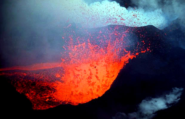
This photograph captures the eruption of a volcano. Colour has been incorporated through the vibrant reds and yellows. You can see the clear contrast between the dark black areas and the vibrant oranges & reds. The lighting itself is very shadowy and dark to link to the theme of the photograph. The photograph has been taken slightly from above & is a close up image which allows you to see the eruption in more detail. The eruption gives the photograph a 3D effect. 


This photograph shows the technique overlay, the same image is placed over the top of the background image. Colour has been incorporated through the use of the building lights. There is a contrast shown between the vibrant red and the dark black areas & then the other colours themselves. 
As the photograph is a close up image the buildings 
seem to be of larger scale. 

Influence: This photographer has influenced me to incorporate vibrant colours into my work & also think about contrast & composition as from looking at Haas's work I have found that the composition is well thought about. Also this photographer has influenced me to add street photography into my work as they show colour really well, whether it be the buildings themselves or the street lighting. 

Summary: Overall I have found that this photographer has influenced my work as I have incorporated street photography into my work to show colour through London & graffiti. However I'm not as interested in this photographers work as I was at the start due to the fact that other photographers work I have been looking at show colour in a different more exciting way. 

Photographer One- Martin Parr

Why Chosen: I have chosen this photographer as I looked into Martin Parr's work at the very start of the project & his work is one of the reasons why I ending up choosing 'Documenting in Colour' as I liked the variety of his work & the natural feel that it has behind it. Martin focuses his photography on everyday events, for example: eating, going to the beach ect. When looking at Martin's work I also found that he shows colour through people, either their clothing or their actual skin tone. 


In this photograph above you can see that colour has been incorporated through the bright blue sky & the British flag. The colour of the chips also appear to be a main focus of the image as they are also vibrant, however this supports Martins fascination with photographing events & when you go to the sea side you see sea goals eating leftovers. The lighting of this photograph is very natural as its sun lighting. The photograph has been taken from a directly in front angle and the composition is very specific, he focuses the composition around the two sea goals. 


This photograph above is a massive multiple imagery piece of majority of Martin Parr's work. It shows a variety of different bold colours through different subjects, for example: food wrappers to peoples hair lines, this shows a wide range of ideas & this is what I have found interesting in his work. The photographs within the multiple imagery piece are close up images. 


In this photograph above you can see that colour has been shown through the use of food. The lighting used is very shadowy around the cake itself. A table cloth has been used as the background to give the photograph a natural feeling rather than making it look posed. The photograph being a close up image makes it more appealing to look at as it allows the cake to be the main focus of the image rather than the background & also the photograph itself is very appealing to look at as its food & everyone likes to look at 
food photography. 


This photograph above shows colour through beach tails & peoples clothing. The photograph has been taken from a high angle which allows the viewer to see the photograph from an above perspective. You can see the contrast between the dark sand and the vibrant colours of the tails themselves. 

Influence: This photographer has influenced me to experiment with my ideas more & show a variety of ideas through my work. Therefore within my project I would like to keep the ideas broad so I can show more variety within my work, meaning I don't just want to photograph people, I would like to photograph objects and do both location & studio shoots. 

Summary: Overall I feel that this photographers work has influenced my work as I have experimented with different ideas throughout my project, I have incorporated both location & studio shoots but also photographed people & objects. I am still very interested in Martin Parr's work as every time I look at his work I seem to find something different or something I don't expect to see because its so different and natural. 

Discussion

For my unit 4 portfolio I have decided to do the following: 

  • Documenting in colour
I have decided to focus this unit on this exam question as I feel this topic would be the most interesting for me but also to look at as colourful photographs are visually pleasing to look at. This is due to the fact that I have looked at my previous work of Unit3 & found that majority of my work shows the use of vibrant colours, therefore I water to carry this on. I have also chosen this topic as I feel I don't always need to rely on having a model as I can photograph objects as well as people, therefore this will make the process easier for me but I feel it will also make my work better as it gives me more variety for shoot ideas but also I can arrange the shoots around me rather than other people. This topic also allows me to experiment with both studio & location shoots therefore it gives me a huge range. 

From researching into documenting in colour I have found that bold, vibrant colours are used. I would like to focus on showing vibrant colours throughout my own work in a variety of different ways, for example: 
  • Paint
  • Lights
  • Food
  • Make-up 
  • Graffiti
Overall I feel that this topic allows me to produce the best possible work as it allows me to be very creative and experiment with different ideas but also it's visually pleasing for me & the audience to look at. 

Connective Essay Five

This photograph shows colour through exaggerated make-up. The colour scheme of this photograph consists of different shades of pinks & purples. The lighting used is very soft and natural, no shadows are created on the models face. The background is also a very natural colour, a similar shade to the models skin tone. The photograph has been taken from the side & only half one side of the is shown. The photograph has been taken from close up to show the exaggerated eye lashes and different coloured eyeshadow.

This photograph is my own photograph that I have taken of exaggerated make-up to show colour through my work. I used soft pinks & blue along with other colours to show a variety of different colure. I also used soft lighting to create no shadows on the face but also to highlight the smoothness of the models skin. Within the composition of this photograph I only included the top half of the models face as I felt the eyes were the most exaggerated part along with the sequins creating a pattern on the models head. I used a black background to make the colours stand out. 

Overall these two photographs connect because they both show colour through exaggerated make-up. Also these photographs connect because the same soft lighting has been used. Both of the photographs are close up images and the composition only includes half of the models face. However they also differ as the first photograph tends to stick with a pink tone colour scheme, whereas in my photograph I have used a variety of different colours. 

Connecting Essay Four


This photograph shows the print technique Photo Joiner. Graffiti is used to show colour within the photograph. Separate photographs have been taken of close up areas of the graffiti and then placed back together in a specific order to make it back up again. Although the graffiti in this photograph is very colourful, the colours aren't very vibrant and the photograph comes across very dull as the lighting seems to be very dusk and grey. 


This photograph is my on photograph that I have taken of graffiti to incorporate colour into my work as my area of focus is documenting in colour. I decided to take pictures of small sections of the gratified wall and put them back together to make a photo joiner. I used natural lighting as it was a location shoot. I also used selective colour in the photograph as I made the background black and white, I also made the colours very vibrant and bright as I wanted them to be very vivid & interesting to look at. 


Overall these two photographs connect because the subject of the image is graffiti. They also connect because they both use the same photo joiner technique. Both of the photographs are also very colourful which is also another connection, however in the first image the colours are fairly dull, whereas in my photograph the colours are very vibrant. The photographs also link as they are both close up photographs. 

Connecting Essay Three

This photograph shows colour through the use of sequins placed around the eyes. A variety of different coloured sequins have been used to show variety & contrast. The model has avery natural skin tone which is very similar to the colour of the background this makes the sequins the main focus of the photograph as the draw the eye. The lighting in this photograph is very soft and creates no shadows on the models face as it creates a very neutral feel to the photograph. The photograph is a close up image as its highlighting the key areas of the face where the sequins are placed. 


This photograph is my own photo. I used sequins to cover the face but also show contrast as I covered half the face in red sequins & the other in red ones. In this image you can only see a small section of the face, however I like the closeness & the angle of this photograph as it feels like you can touch the sequins as its almost like they are 3D rather than 2D. I used a black background, however it was really incorporated in the image as I took mainly close up photographs. I used a shadowy lighting to create darker areas across the right hand side of the models face. 

Overall these two photographs connect because they both use sequins to show colour & highlight features on the face. Both photographs include more than one colour of sequins. Also the photographs connect because they are both close up photographs. On the other hand the photographs differ as the lighting is different, the first photograph is very soft and neutral, whereas my photograph is fairly shadowy. 

Connecting Essay Two


This photograph shows the use of the technique Selective colour. This technique has been used in this photograph to show colour. The background has been made black & white but the main subject is still in colour. A red colour scheme is shown through the photograph along with the theme of London as these telephone boxes are associated with London. The lighting used is soft as not shadows are created in the photograph. You can see the clear contrast in this photograph between the black & white background and then the vibrant red telephone box. 

This photograph is one of my own photographs for documenting in colour. I decided to use the technique Selective Colour to show colour through my work. As you can see the background is black & white but the subject closest to the camera is still in colour. I used soft lighting as I didn't want any shadows in the photograph. I took the photograph slightly from a side angle to make it look like the bus was moving through the photograph . I decided to keep the vibrant red bus in colour as I liked how the red stood out against the background & it helped portray the London theme that I wanted to create. I took a close up image as I didn't want to include too much of the background as I didn't want people in the photograph & I wanted you to be able to read the bus number & where its going (Hampstead Heath 24) to show that its a London bus.

Overall these photographs connect because they both use the technique selective colour. They also connect because of the London theme & the red colour scheme running through both photographs. The lighting in both photographs are also the same. On the other hand these photographs differ as they are of different subjects, the first photograph shows a telephone box and my own photograph shows a red bus. 

Connecting Essay One

This photograph shows colour through paint dripping down the models face. A variety of different colours have been used to show the contrast between them. Colour has also been added into the photograph through the use of make-up, the model is wearing green eye shadow which links to the colour theme of the background as it is the same green shade. The photograph is a close up image which allows you to see the paint dripping from a closer perspective & makes the photograph more effective as it also shows the colours starting to mix. Slightly shadowy lighting has been used in this photograph to create shadows/darker areas on the models right side of the face. 


This photograph is my own image. I have also used paint in order to incorporate colour into my work. I used liquid tubed paint to create the dripping effect. From my photography you can see that I used soft high key lighting to create no shadows on the models face & to highlight the vibrant colours. I used a variety of different colours to show a variety & contrast in my work. I took the photograph from a close up range to allow the audience to see the patterns the paint is making and the colour mixing. I took the photograph from directly in front of the model as I wanted to show all her features in the photography. 


Overall these photographs connect due to the fact that they both use paint to incorporate colour. In both photographs the paint is shown to be dripping down the face. Another reason why the photograph connect is they are both close up photographs. Also in both photographs the models eyes are closed. The photographs also differ as different lighting has been used, in the first photograph shadows are created where as in my photograph no shadows are shown. 

Wednesday, 15 April 2015

Work Record- Shoot 10

In todays lesson I did a location shoot of graffiti to show colour. However when photographing graffiti you have to make it your own, for example you have to include a person or part of the background to make it look different, therefore I couldn't take close up photographs. However I found that included a person made the photographs look a lot more unique & i much preferred them. 
If I was to do this shoot again I would focus more on including people into my photographs & even have random people just walking by as it will make my photographs look more natural as I like natural feeling photographs.

In this photograph I used a model to make the photograph my own. I had the model wear a tracksuit as it fitted with the scene but also as it is plain grey it made the vibrant graffiti stand out more. 
If I was to take this photograph again I would think about the composition more as there is a lot of head space however I found it hard to decrease the amount as it didn't allow me to include all of the painted face. 


This photograph shows colour throughout he use of graffiti. I have edited the photograph to make the space around the graffitied wall black and white, I did this to draw the attention tot he colour of the graffiti. 
If I was to take this photograph again I would include more of the background/path as I feel it would have made the selective colour technique more effective. 

Inspiration: 

My inspiration for this shoot came from my very first shoot that I did of selective colour in London as I liked the urban street feeling that that photographs created and I also really like street photograph, therefore I started looking into graffiti photography & found the photographer Dez Santana. I really liked his work & wanted to do something similar myself. 

Work Record- Shoot 9

In todays lesson I did another paint shoot as the previous shoot that I did using paint didn't go as I planned but I still really liked the outcome, however I still wanted to re-do the shoot to see if I could produce the photographs that I wanted as I wanted the paint to drip down the models face & in my previous shoot the paint I used was too thick. However this time it worked perfect. 
If I was to do this shoot again I would experiment with video to show the models expressions when the paint is poured onto her face. 

This photograph shows a close up image of the side of the models face, it allows you to see the paint dripping from a closer perspective & you can see that the colours are starting to mix. I used a black background to highlight the vibrant colours on the models face. 
If I was to take this photograph again I would experiment with different close up photographs that I could take of different parts of the face. 


This photograph shows different small sections of the models face which I then made a multiple imagery piece with as I liked the closer photographs as it allowed you to see the colours mixing. I used high key lighting in order to create no shadows on the models face and make the colours appear bright. 
If I was to make this multiple imagery piece again I would experiment with adding more photographs to make one massive, big multiple imagery piece. 


Inspiration: 

My inspiration for this shoot came from my previous shoot that I did using paint. This is because I was inspired by a photograph that I found online, however when I did the shoot the paint didn't drip like I wanted it to as it was too thick, therefore I did the shoot again as I was inspired by the outcome of my previous paint shoot as I still liked the images although they wasn't exactly what i wanted, therefore it made me want to re-do the shoot. 


Work Record- Shoot 8

In todays lesson I experimented with a new idea to show colour. I wrapped christmas lights around the models face as I was inspired by a photograph that I saw online. However due to the fact that I had seen this specific picture & my photographs didn't look exactly like the image I was disappointed with my outcome as I couldn't get the lighting the way I wanted it as the models skin colour was effected. I used a black background. 
If I was to do this shoot again I would have to keep experimenting with the different lighting until I got it right, however I don't feel that I could progress with this shoot any further. 


This photograph is one of the better photographs that came out of this shoot. I used the overlay technique to show the same image twice. I like the models skin tone in this photograph as you can only slightly see her face which makes the lights the main focus which I wanted. I used a black background to make the colours of the bright lights stand out against it. 
If I was to take this photograph again I would experiment with different angles that I could take this photograph from. 


In this photograph you can see around the models ear the lighting along with the christmas lights has caused the models skin to go bright red. Also the lights in this photograph to not seem to be as vibrant as I would have wanted them. On the other hand I do like the side angle that this photograph has been taken from. 
Therefore if I was to take this photograph again I would adjust the lighting. 

Inspiration: 

My inspiration for this shoot came from a photograph that I had seen online of christmas lights wrapped around a mans face. I used the same black background but feel that I may have needed to use more christmas lights to achieve what I wanted. 

As a result of this shoot I'm not going to progress with this idea as i don't feel I am going to get the same quality photo as the photograph that I am inspired by. Therefore I am going to look into showing colour in a different way. 


Work Record- Shoot 7

In todays lesson I did another studio shoot to show colour. I used vibrant pink doughnuts as I found that this was commonly done by the photographer Martin Parr and I wanted to do it in my own way. I used a white background and high key lighting in order to create a soft lighting with no shadows. This highlighted the vibrant pink icing on the doughnuts. 
If I was to do this shoot again I would experiment with included more of the background like in Martin Parr's photography but have a table cloth as this also brings colour into the photographs. 


In this photograph I used two pink doughnuts to show colour through food. I placed one of them onto of the other to create a 3D effect to the image. I used a white background & high key lighting to create soft lighting. 
If I was to take this photograph again I would experiment with different angles I could take the photograph from. 
This photograph shows contrast between the black & white areas & then the pink sprinkles. I did this during the editing process to highlight the vibrant pink colour of the sprinkles. I took the image from a high angle to show the subject from above. 
If I was to take this photograph again I would experiment with making an animation, maybe have the doughnut being eaten, one piece at a time. 

Inspiration: 

My inspiration for this shoot came from my previous shoot of showing colour through the use of food but also as I've been looking into Martin Parr's photography & I found he shows colour through food photography & I specifically liked his cake/doughnut photography. 

As a result of this shoot I feel that I have gone as far as I can with showing colour through the use of food & would like to experiment with different more unique ideas for future shoots. 

Work Record- Shoot 6

In todays lesson I did a studio shoot using M&M's to show colour. I used a white background to highlight the vibrant colours of the M&M's. I decided to use the brown packet of M&M's as I liked the use of dark brown & vibrant colours in my previous shoot. 
If I was to do this shoot again I would experiment with making an animation to make it look like the M&M's are actually exploding out of the bag. 


In this photograph I have used M&M's to show colour. I used the boom lighting to highlight the white background. This helped to show the vibrance of the M&M's. I took this photograph from above to show the photograph from a different perspective as it looks like the M&M's have exploded. 
If I was to take this photograph again I would experiment with the different angles & focus more on the composition of the photographs. 


This photograph shows the M&M's from a different point of view, the angle of the photograph being directly in front allows you to see into the packet and you can see the difference between the shadowed M&M's inside and the vibrant ones outside. I used a white background and the boom lighting as its an overhead lighting it lights up the whole subject.
If I was to take this photograph again I would think more about the arrangement of the M&M's and the composition of them as some of them are slightly cut out. 


Inspiration: 

My inspiration for this shoot came from my previous shoot as I liked the vibrant colours of the M&M's, therefore I wanted to use them in a different way. I also liked the contrast between the bright and dark colours, for example: in my previous shoot I used dark ground coffee beans & a vibrant M&M. 

As a result of this shoot I am going to look more into showing colour through food as I have been looking at Martin Parrs photography & he tends to use a lot of food to show colour through photography. For example: 


Work Record- Shoot 5

In todays lesson I did a studio shoot to show contrast. I used coffee beans as they are dark brown & then I placed a vibrant green M&M on top to show the contrast between the two. I used soft lighting to create no shadows. I also used the boom light which allowed me to take the photographs from above as the light was from above. 
If I was to do this shoot again I would experiment with different coloured M&M's as I only used the green one. I would also experiment with making a multiple imagery piece. 

In this photograph I have used dark coffee beans and a bright M&M to show contrast. I have only included one single M&M as I believe it has a better effect when looking at the image, it draws the eye to the position of the M&M. The photograph being a close up image allows you to see the detail on the coffee beans and the letter 'm' on the M&M. I used soft lighting. 
If I was to take this photograph again I would experiment with different angles that I could take the photographs from. 

This photograph again shows contrast between the dark coffee beans and the vibrant green M&M. I used soft lighting to create no shadows. I took this photograph from directly in front of the subject, therefore the coffee beans look more 3D rather than 2D in the above photograph. 
If I was going to take this photograph again I would use different coloured M&M's to show variety within the shoot.

Inspiration: 

My inspiration for this shoot came from a photograph that I found on google when looking at contrast images. I liked how it was simple but interesting & I liked the use of dark and vibrant colours. My inspiration for looking into contrast within photography came from my previous shoot of paint as I liked the contrast between the different coloured paint.

As a result of this shoot I am going to look into experimenting with contrast & colour through the use of M&M's as I liked the variety of colours & how vibrant they were.